In the previous part of this tutorial, we saw how to get started with D3.js, and created dynamic scales and axes for our visualization graph using a sample dataset. In this part of the tutorial, we'll plot the graph using the sample dataset. To get started, clone the previous tutorial source code from GitHub.
Navigate to the Google App Engine (GAE) SDK directory and start the server.
1
./dev_appserver.py PythonD3jsMashup_Part2/
Point your browser to http://localhost:8080/displayChart and you should be able to see the X and Y axes that we created in the previous tutorial. Before getting started, create a new template called displayChart_3.html which will be the same as displayChart.html. Also add a route for displayChart_3.html. This is done just to keep the demo of the previous tutorial intact, since I'll be hosting it on the same URL.
Creating the Visualization Graph (With Sample Data)
From our sample dataset, we have a number of count to be plotted across a set of corresponding year.
01
02
03
04
05
06
07
08
09
10
11
12
13
14
15
16
17
18
19
20
21
22
23
24
25
26
27
28
29
30
31
32
33
34
35
36
37
38
39
40
41
42
43
44
45
46
47
48
49
50
51
52
53
54
55
56
57
58
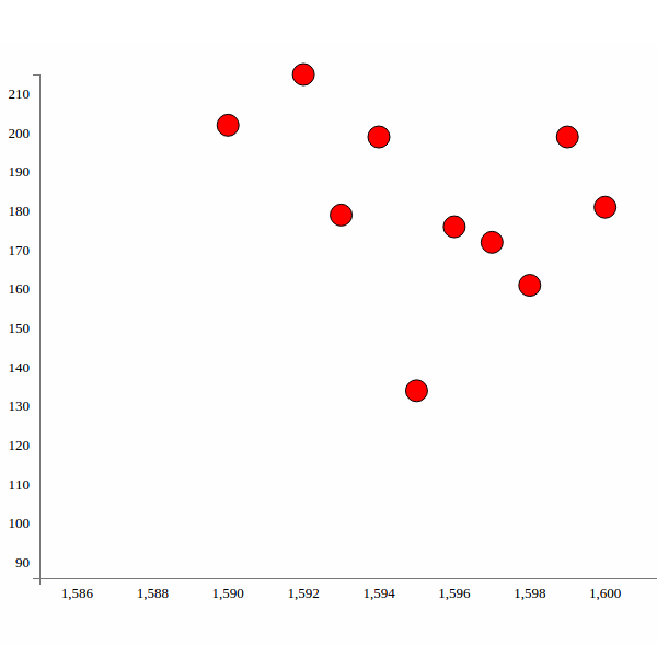
vardata = [{
"count": "202",
"year": "1590"
}, {
"count": "215",
"year": "1592"
}, {
"count": "179",
"year": "1593"
}, {
"count": "199",
"year": "1594"
}, {
"count": "134",
"year": "1595"
}, {
"count": "176",
"year": "1596"
}, {
"count": "172",
"year": "1597"
}, {
"count": "161",
"year": "1598"
}, {
"count": "199",
"year": "1599"
}, {
"count": "181",
"year": "1600"
}, {
"count": "157",
"year": "1602"
}, {
"count": "179",
"year": "1603"
}, {
"count": "150",
"year": "1606"
}, {
"count": "187",
"year": "1607"
}, {
"count": "133",
"year": "1608"
}, {
"count": "190",
"year": "1609"
}, {
"count": "175",
"year": "1610"
}, {
"count": "91",
"year": "1611"
}, {
"count": "150",
"year": "1612"
}];
We'll represent each of the data points as circles in our visualization graph. D3.js provides API methods to create various shapes and sizes. First, we'll use d3.selectAll to select circles inside the visualization element. If no elements are found, it will return an empty placeholder where we can append circles later.
1
varcircles = vis.selectAll("circle");
Next, we'll bind our dataset to the circles selection.
1
varcircles = vis.selectAll("circle").data(data);
Since our existing circle selection is empty, we'll use enter to create new circles.
1
circles.enter().append("svg:circle")
Next, we'll define certain properties like the distance of the circles' centers from the X (cx) and Y (cy) axes, their color, their radius, etc. For fetching cx and cy, we'll use xScale and yScale to transform the year and count data into the plotting space and draw the circle in the SVG area. Here is how the code will look:
01
02
03
04
05
06
07
08
09
10
11
12
13
14
15
16
17
varcircles = vis.selectAll("circle").data(data);
circles.enter()
.append("svg:circle")
.attr("stroke", "black") // sets the circle border
.attr("r", 10) // sets the radius
.attr("cx", function(d) { // transforms the year data so that it
returnxScale(d.year); // can be plotted in the svg space
})
.attr("cy", function(d) { // transforms the count data so that it
returnyScale(d.count); // can be plotted in the svg space
})
.style("fill", "red") // sets the circle color
Save changes and refresh your page. You should see the image below:
Modifying Google BigQuery to extract relevant data
In the first part of this series, when we fetched data from BigQuery, we selected some 1,000 words.
We have a dataset which contains a list of all the words which appear across all of Shakespeare's work. So, to make the visualization app reveal some useful information, we'll modify our query to select the number of times a particular word, for example Caesar, appears in Shakespeare's work across different years. So, log into Google BigQuery and we'll have a screen like the one shown below: After we have logged into Google BigQuery, we'll have an interface where we can compose and check our SQL queries. We want to select the number of times a particular word appears across all of Shakespeare's work. So our basic query would look like this:
The above query gives us a result set as shown below: Let's also include the group of works corresponding to the Word Count. Modify the query as shown to include the corpus:
Also include a new route for GetChartData as shown.
1
2
3
4
5
6
7
application =webapp2.WSGIApplication([
('/chart',ShowChartPage),
('/displayChart',DisplayChart),
('/displayChart3',DisplayChart3),
('/getChartData',GetChartData),
('/', ShowHome),
], debug=True)
Finally update the code to the GAE platform.
1
./appcfg.py update PythonD3jsMashup_Part2/
Point your browser to http://YourAppspotUrl.com/getChartData which should display the resulting data from BigQuery. Next, we'll try to parse the data received from Google BigQuery and convert it into a JSON data object and pass it to the client side to process using D3.js. First, we'll check if there are any rows in dataList returned. If no rows, we'll set the response as null or zero.
Update the app into GAE and point your browser to http://YourAppspotUrl.com/getChartData and you can see the returned JSON response. Next, we'll create an interface to query the Google BigQuery dataset from our app dynamically. Open up Templates/displayChart_3.html and include an input box where we'll input keywords to query the dataset.
Include a jQuery script in the page and on the DOM ready event, we'll query the Python method GetChartData on Enter Key press.
1
2
3
4
5
6
7
8
$(document).ready(function() {
$("#txtKeyword").keyup(function(event) {
if (event.keyCode == 13) { // If enter key press
DisplayChart();
}
});
InitChart(); // Init Chart with Axis
});
Create another function DisplayChart on the client side, inside which we'll make an Ajax call to the Python GetChartData method.
01
02
03
04
05
06
07
08
09
10
11
12
13
14
15
16
17
functionDisplayChart() {
varkeyword = $('#txtKeyword').val();
$.ajax({
type: "GET",
url: "/getChartData",
data: {
inputData: keyword
},
dataType: "json",
success: function(response) {
console.log(response);
},
error: function(xhr, errorType, exception) {
console.log('Error occured');
}
});
}
Update the code to GAE and point your browser to http://YourAppspotUrl.com/displayChart3. Enter a keyword, say Caesar, and press Enter. Check your browser console and you should see the returned JSON response. Next, let's plot the circles using the returned response. So create another JavaScript function called CreateChart. This function is similar to the InitChart function but the data would be passed as parameter. Here is how it looks:
From now on, when we load the /displayChart3 page, circles won't be displayed. Circles will only appear once the keyword has been searched. So, on the success callback of the DisplayChart Ajax call, pass the response to the CreateChart function.
1
2
3
4
success: function(response) {
console.log(response);
CreateChart(response);
}
Update the code to GAE and try searching for the keyword Caesar. OK, so now we get to see the result as circles on the graph. But there is one problem: both the axes get overwritten. So in order to avoid that we'll check inside the CreateChart function if the axes are already there or not.
As you can see, we just checked if the SVG element has axes, and if not we create them again. Update the code to GAE and try searching again for the keyword, and you should see something like this:
Wrapping It Up
Although all looks good now, still there are a few issues which we'll address in the next part of this tutorial. We'll also introduce D3.js transitions and a few more features to our D3.js graph, and try to make it more interactive. The source code from this tutorial is available on GitHub.
In this tutorial, we are going to design a set of icons in Adobe Photoshop. An icon set needs to have the same background and theme. For learning purposes, we are going to design a sun icon, an ice flake icon, and an RSS icon. Let's get started. 1. Preparing the Canvas Step 1 Start by making a new file with size 350 px × 350 px . Click the small box next to the Background Contents option to change the new canvas color. Step 2 In the Color Picker dialog box, select grey ( #e0e0e2 ) for the canvas background color. Step 3 It is always a good idea to keep your work structured from the start. Make a new layer group and name it sun . This is where we will place all layers used in the sun icon. 2. Designing the Icon Base Step 1 Use the Rounded Rectangle Tool to draw a rectangle with size 83 px × 64 px and 8 px radius. To get accurate results, use the Properties panel. In this panel, you can simply enter the exact siz...
I'm going to discuss how I like to implement a rope-swinging gameplay mechanic. When I started working on Energy Hook I mostly did everything with my own custom code. I believe it's possible to simply go into Unity and use the Configurable Joint to do some very similar stuff, but at the time it wasn't available. I'm pretty sure this has been the right call, anyway, because it gives me control over everything - and I can share it with you. The fundamentals of doing swinging the way I did - using constraints - are actually quite simple. (Hope you're not disappointed when you see what's under the hood.) It works the same whether you're making a 2D game or 3D game, it's just that the vectors are different, so I'll start off with 2D and then discuss some wrinkles when going to three dimensions. This article also assumes you're using a game engine like Unity that can do a lot of the work for you, like raycasting against geometry and orienting a chara...
In my previous article Android Login and Registration Screen Design i explained designing the login and registration interfaces, but it has no functionality. In this tutorial i am explaining how to build complete login and registration system in android using PHP, MySQL and SQLite. Also this tutorial covers how to build simple API using PHP and MySQL. Prerequisites This tutorial is combination of some of my previous tutorials. I hope you covered these tutorials before. Android making HTTP Requests Android JSON Parsing Tutorial Android SQLite Database Tutorial Android Login and Registration Screen Design API (Application Programming Interface) ⇒ Accepting requests by GET/POST methods ⇒ Interact with PHP classes to get data from database or store in database ⇒ Finally will give output in JSON format 1. Creating MySQL Database and Tables As I am writing API in PHP I selected MySql database to maintain users and other related information. Open your mysql console or phpmyad...


Comments
Post a Comment